
by Zach Woolfork
In this post, I’ll walk you through my process for designing the photo and video grid sections for Semeion’s photography and videography landing page. My goal was to create something fresh and distinct, moving away from the typical portfolio layouts commonly seen on photographers’ and graphic designers’ websites.
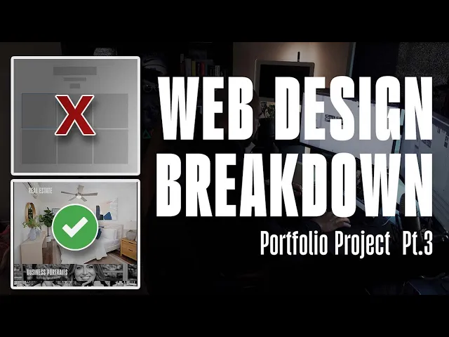
Breaking Away from the Norm
When browsing portfolio templates on platforms like Webflow, I noticed that many photography websites rely on standard grid layouts. While these are quick and functional, they’re also very common. For Semeion’s site, I wanted to challenge myself to design something unique that would stand out.
Before starting this project, I had been experimenting with photo grid animations using Figma’s auto layout feature. I played with ideas like vertical accordion effects and smooth hover animations. These experiments gave me confidence in creating dynamic, interactive elements, so I decided to apply similar concepts to Semeion’s website.
The Design Concept
Semeion’s work spans multiple industries, including fitness, private events, real estate, and business portraits. My goal was to showcase his diverse portfolio in an engaging way. I initially considered a carousel where users could manually click through images, but I ran into some technical challenges. Instead, I opted for an automated slideshow approach, where users could hover or click a section to view a sequence of images or videos playing automatically.
Each section (fitness, private events, business portraits, and real estate) would expand on interaction, revealing a slideshow of Simeon’s work. To keep things manageable in Figma, I avoided creating dozens of individual components for each image. Instead, I used Photoshop to create short GIFs for each section, compiling multiple images into a single animation that cycles every few seconds.
Building the Animations in Photoshop
In Photoshop, I compiled images for each section (e.g., business portraits) into a timeline to create a GIF. Initially, I considered making short videos, but the file sizes became too large for smooth integration into Figma. GIFs provided a lightweight solution, maintaining decent quality while keeping file sizes manageable. Each GIF was set to cycle through images every 3 seconds, creating a seamless slideshow effect.
For the fitness section, I incorporated videos instead of images. Simeon had long-form, interview-style fitness videos on his website, so I edited them into shorter clips (about 60 seconds total) to fit the section’s frame. For the video grid, I pulled content directly from Simeon’s Instagram to maintain the correct aspect ratio and avoid unnecessary editing.
Prototyping in Figma
In Figma, I set up the grid with a cover image for each section, using a luminosity blend mode to create a grayed-out effect when inactive. On hover or click, the section would expand to reveal the GIF or video. I manually adjusted the animations since auto layout wasn’t used for the movement. Each section was set to a consistent height (960 pixels) when expanded, with text and elements carefully aligned.
For the interaction, I used Figma’s smart animate feature with an ease-out transition at 150 milliseconds. One challenge was that the GIFs would start cycling as soon as the page loaded, so the cover image might not always match the first image in the slideshow. However, I felt this wouldn’t significantly impact the user experience, as the focus was on showcasing Semeion’s work.
The video grid followed a similar setup, with sections expanding on hover. I varied the animation direction for visual interest—some sections opened from left to right, others from right to left, and some expanded from the center. This balanced approach ensured the layout felt dynamic yet cohesive.
Pulling from Social Media
One great aspect of Semeion’s work was the wealth of content available on his social media. I incorporated Instagram videos into the video grid to highlight his active online presence and share his journey as a photographer and videographer. Using Instagram content also simplified the process, as the videos were already formatted for the web.
Lessons Learned & Final Thoughts
This project was a fun opportunity to experiment with unique layouts and animations. For anyone working on personal portfolio projects, I recommend taking the time to play around with creative ideas. Once client work picks up, you may not have as much freedom to experiment, as clients often prefer simpler designs.
Overall, I’m pleased with how the photo and video grid turned out for Semeion’s website. It’s a fresh take on the traditional portfolio layout, and I hope it inspires others to think outside the box. What do you think of the final result? Let me know your thoughts, and if you found this breakdown helpful, feel free to share!