
by Zach Woolfork
Initial Reaction
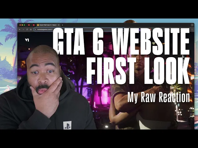
I discovered the Grand Theft Auto 6 website while watching a YouTube breakdown of the highly anticipate game by Rockstar, and was impressed by the clean, smooth design. I found the site unexpectedly through trailer commentary and felt compelled to explore and review it live. Below are some cool features, observations, and overall impressions of the GTA 6 website.
Website Features & Visuals
Hero & Trailers
Homepage features a trailer in a pop-up modal.
Layout is minimalist but effective — it's very simple and clean.
Scrolling & Visual Flow
Smooth transitions with no jitter— it's buttery smooth.
Vertical scrolling reveals parallax-like video movement as if scrubbing through a film sequence.
Text and image sections animate in cleanly, with inside-stroke hover effects on images.
Typography & Style
Unique custom typeface “GTA Deco” adds personality.
I noticed a “Pirates of the Caribbean” style font for certain headings.
Text/background color transitions help set the mood of each section.
Characters & Storytelling
Uses two-column layouts to introduce characters (e.g., Lucia, Jason) and their backstories.
Effective mix of character imagery, typography, and animated transitions builds narrative immersion.
Location & Environment Exploration
Visually rich transitions into Vice City and surrounding environments.
Horizontal scroll section for Vice City — very appropriate UX/UI choice.
Natural elements like birds and boats animate subtly, creating a living world feel.
Explorable areas include Everglades-like wetlands, outdoor parks, industrial zones.
User Experience & Interaction
Great UX touches like:
Smooth scroll behavior.
Back button functionality (returns user to their place, not top).
Downloadable wallpapers and assets (without right-clicking).
Accessibility options like “Reduce Motion” toggle (which significantly reduces memory usage but degrades smoothness).
Tech Stack Observations
Using browser tools, I noted the site consumes 5–6 GB of RAM in full experience mode.
After toggling “Reduce Motion,” usage drops to under 1 GB, confirming heavy reliance on animation and assets.
Site built with React + Next.js + GSAP – modern tech stack praised for fluidity.
Personal Reflections & Inspiration
I want to experiment with more with some these techniques and implement in my projects if applicable:
Parallax effects (3 layers: text, subject, background).
Color-changing gradients as a mood-setting tool.
Microinteractions and hover effects to enhance experience.
Overall Impression
The GTA 6 website is one of the sickest landing pages I've seen in a while — especially for a video game site. The blend of cinematic content, web animation, and UX/UI polish makes it stand out. I look forward to revisiting when new trailers drop to analyze site changes or evolutions.